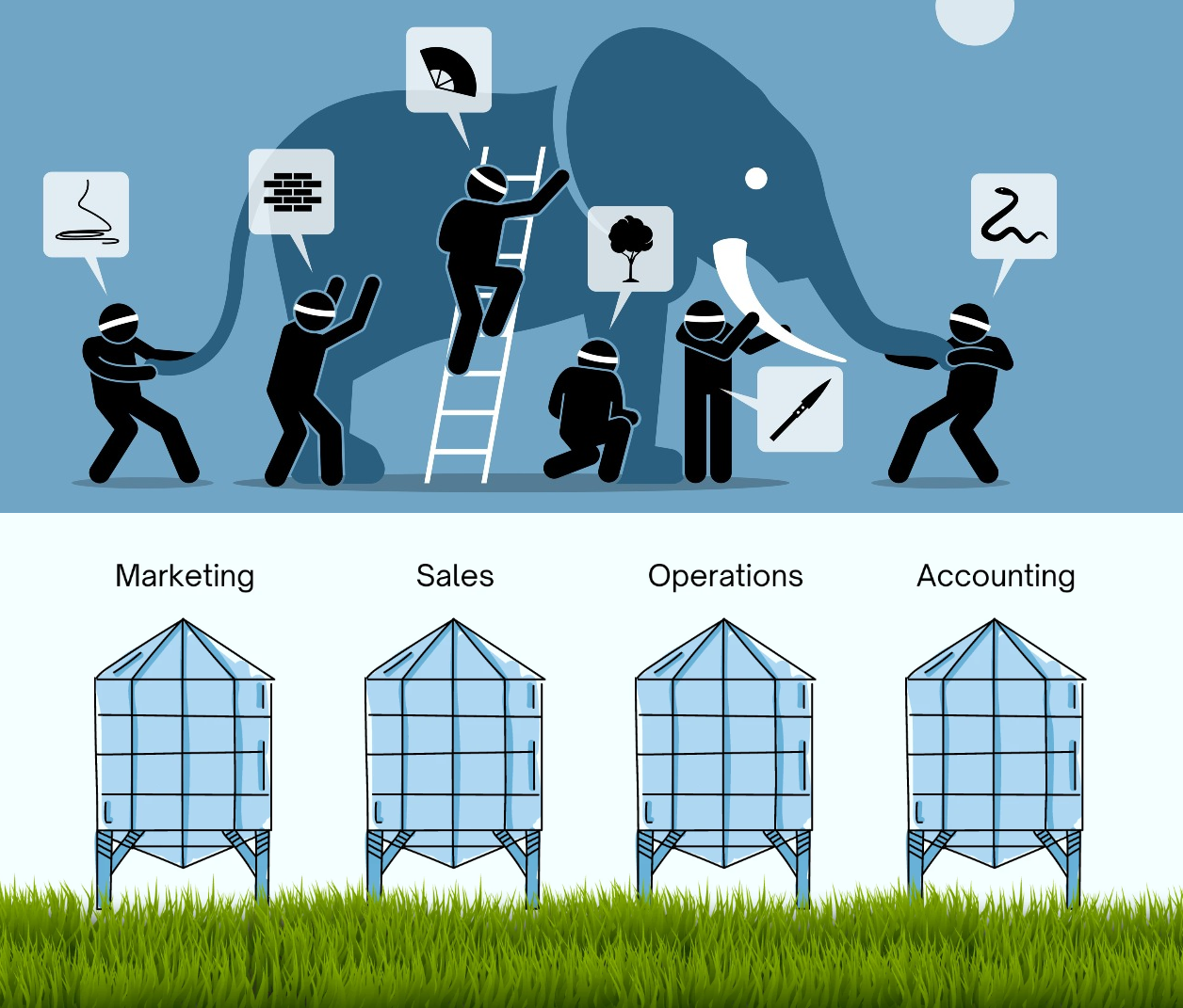
A famous Indian parable describes five blind men encountering an elephant for the first time. They each decide to touch the elephant to understand what the animal is like.
“An elephant is smooth and hard, like bone,” says the man who grasped its tusk
“Nonsense, an elephant is soft like leather,” says the man who felt its ear.
“You’re both wrong; an elephant is rough like a tree,” says the man who touched its leg.
The five men begin arguing vehemently, each convinced that he is right. None of them manages to convince the other of anything, except that everyone else is untrustworthy.
This is my favorite fable. It says so much in so few words, about the way we reside in our lonely heads, why alignment is an Everest mountain, how the shape of truth is diamond-faceted.
I see this story often used to describe organization dysfunction — See? This is why Sales and Product keep quarreling!
But hear me out. Recently, I’ve started to see this story as a perfect embodiment of another topic: the 3 most common mistakes teams make in using data.
Ready to explore this elephant with me?
Mistake #1: Rejecting Data that Doesn’t Match Your Beliefs
The obvious thing we — who are not newbies to elephants — can recognize is that none of the blind men are wrong!
An elephant is simultaneously soft like leather, smooth as a bone, and rough like tree bark. It’s also a million other adjectives, because it’s a complex, majestic animal! Such is our world, one where we extol the wise words of Walt: Do I contradict myself? Very well then I contradict myself (I am large, I contain multitudes).
But in a team setting, when you’re locked in a tense battle of wills, it’s hard to remember this. Everything becomes binary.
Consider a data analyst sharing experiment results: Unfortunately, this new redesign decreased user engagement by 5%.
No way, retorts the designer. This redesign is way WAY better. Can’t you see for yourself how much simpler it is? People loved it in the lab. And look at this Twitter feedback! <cue visual of many fire emojis>
I’m embarrassed to admit I have made various forms of the above argument. Like the blind men, I turtled into a narrow definition of the truth: I only embraced data that confirmed what I wanted to believe — This redesign is Awesome!
This is the number one killer of data discipline: Instead of testing my intuition with data, I was seeking data that confirmed my intuition.
In most instances where we bring up conflicting pieces of data, the reality is that both viewpoints are true — there are indeed people who love the new redesign, while on average it causes more people to use the feature less (a lesson I learned the hard way, see Exhibit A here).
Instead of trying to prove one’s opinions, we should aim to broaden our view of reality to incorporate all the data. Only then will we more clearly “see” the whole elephant.
Mistake #2: Selecting Ineffective Methods of Measurement
If none of the blind men were technically wrong about the elephant, then the million dollar question becomes:
What, exactly, is the best way to describe an elephant?
Just now, I asked this question to a pack of kids in my yard. They hollered out answers like Big! Long trunk! Grey! Nobody in this (admittedly limited) study suggested comparisons to bone, trees, or leather.
Perhaps using touch to describe an elephant is unideal. Perhaps limiting said touch to a few inches of surface area on a single occasion is even less ideal.
If 5 people in a research lab swiped around your feature muttering yeah, this is nice, would you conclude that your entire population of 20M users will love it?
When we talk about data, we must accept that every standard of measurement is a proxy for reality. Picking the best proxies to shed light on what you care about is an art, not a science. Every metric you come up with will have shortcomings in conveying the complete truth.
Take Time Spent On App, for instance. This metric is often used as a proxy for answering How worthy of one’s precious time is this?, aka more Time Spent = More Valuable Service. Netflix, TikTok, and Fortnite proudly brandish their time spent numbers.
But take the case of a travel booking site. When I browse for flights or a hotel, I’m typically searching for a good price on a particular date and location. If I spend a lot of time on the site over a few days, what does that reveal? That I’m having fun exploring hotels? That I’m frustrated because it’s taking forever to find options that match my criteria? It’s murky; time spent isn’t super telling in this case.
To know the best way to understand app value or to describe an elephant, we need to know the why. We need a purpose before we need the data.
Help people easily recognize an elephant in the wild if they encounter one is an entirely different purpose than Evaluate whether hunting elephants can be profitable or Determine if wild elephants are thriving.
Once you know your purpose, you must then continually iterate on the best proxies of measurement to give you a picture of reality.
If I’m trying to improve the health of wild elephants, should I take stock of their height or their weight? Their color or their distance travelled? Their lifespan or their herd size? For how many elephants can I get this information easily and accurately? How often can I get updates?
There’s no right answer here; the only way forward is to keep iterating on the best proxies for reality as it relates to our purpose.
Mistake #3: Failing to Turn Disagreements into Learnings
So data is messy and reality skews more complex than we imagine.
What then? Is there anything those blind men could have done to avert the crisis of shattered friendship?
Yes indeed, if only they knew the power of turning disagreements into falsifiable hypotheses, in other words, turning their assumptions into true or false tests.
An example of a good falsifiable hypothesis: Simplifying our onboarding flow will improve new user retention after one week. We can actually make a wager on this! Our whole team can stand around and look at the results of user retention after one week and be exactly on the same page about whether it happened or not.
Contrast this with a less falsifiable hypothesis, like Changing our illustrations will make our product more tasteful. What does tasteful mean? Who gets to judge? We could argue about this all night.
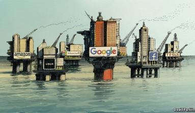
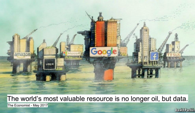
Another way to ask this is: What evidence would convince you that your belief is wrong? Then, listen closely to what the person says and propose a way to collect that evidence. This is what top data-informed companies like Netflix, Google, Amazon do; they love channeling their inner scientist and running A/B tests to test their beliefs.
Even if you can’t do a pure controlled experiment, you can still make concrete guesses about what will happen. Nothing helps a group learn like writing down each person’s bets on a public board and checking the scorecard after the game.
“An elephant is smooth and hard, like bone,” says the man who grasped its tusk.
“Nonsense, an elephant is soft like leather,” says the man who touched its ear.
Imagine if the third man had said, “Let us ask another 100 people what they think, and see what the majority opinion is.”
We’ll all make better decisions — and more friends — this way.
Julie Zhuo (via medium)